Tuesday, May 11, 2010

Final Project!


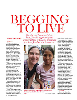
For our final project, we were asked to layout a story we were given randomly from the Travel Writing: Peru class.
The story I was given was about Peruvian street children begging for money or selling trinkets on the streets to locals and tourists alike.
I kept the color scheme simple: black, white and red. I wanted to keep it simple and sharp all while using Peru's colors (white and red.)
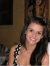
I had a limited selection of pictures to choose from, but the one I placed I like. It's of the author, Sarah Ostman, and a young girl named Delia, whom she met in Peru.
I also chose three pull-out quotes that I thought were especially powerful and would catch readers' attention.

Cover Design

For part of our final project, we were asked to create a cover for our publication "Wanderer."
The stories were all written by the Peru Travel Writing class.
I chose a beautiful aerial shot of Lima and framed my teasers around the skyline.
The teaser titles include, "Surf by Sea, by Sky," "Pisco at the Maury Hotel," "Boho Barrancp," "Red Light Lima," and "Machu Picchu: The 7th Modern Wonder of the World."
I integrated different vivid colors to give the cover a unique and young look.

Type Styles

In conjunction with our final project, we were asked to design our mach-magazine's cover title in at least four different fonts/ways.
I chose bold type to ensure the title stood out on the cover and to create a feeling of strength.
My favorite font is the second sample, with the "n" and the "d" connected. It was my creative take on a normal font.

Photo Layout


Over spring break, we were asked to take pictures of the topic of our choosing. Since I was visiting Memphis, I thought taking pictures of Elvis's Graceland would be a perfect subject.
The main picture I chose was an exterior shot of the house itself above the layout's title "Where Elvis Lives," Graceland's official slogan.
To the left, I chose two equally-sized pictures; one of a case full of his famous jumpsuits and the other of his grave, located in the Meditation Garden at Graceland.
I chose the blue color scheme because blue was Elvis's favorite color!

Tuesday, April 6, 2010

Infographic

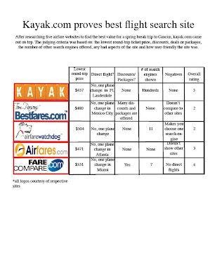
For our next assignment, we were asked to make an infographic to compare travel websites for a spring break trip to Cancun. We researched and compared five different sites based on six criteria: lowest round-trip price, direct or connecting flight, discounts or packages offered, number of search engines shown, any negatives on the site and the overall rating (user-friendliness.)
I wrote a headline and a short deck describing the goal of the project and made a simple, to-the-point chart that's easy to read and interpret. I added the company's logos to give each site its unique identity.

Monday, April 5, 2010

Restore


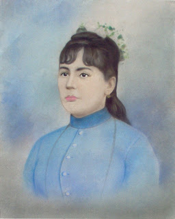
One of our latest assignments was to restore an old photo using Photoshop. To make this picture look as good as new, I used the clone stamp to repair the holes, take the water marks/age spots off of the face, brighten the whites of her eyes, thicken her eyebrows, make her eyes pop by adding a black liner to the top lids, and added some pink color to her lips.

Tuesday, February 23, 2010

Color Project


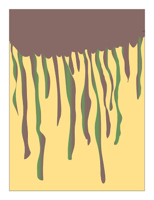
For our project involving color, we were given an emotion and asked to display that emotion through shape and color. The emotion I was given was sloth. No, not the ugly, tree-dwelling mammal, the state of being slow-moving, lazy and all together unmotivated.

To show sloth, my first thought was shape. How can a shape be lazy? I created a mass at the top of the page and had it slowly dripping down to the bottom. Slowly, lazily, dripping.

The second step was adding color. I opted for brown, green and yellow; all colors that, to me, seem pretty lazy. Brown makes me think of slow molasses and green makes me think of a thick, oozing slime.